Wednesday, 4 December 2013

Trouble with Male Models & Design Development - Macho Man

The model that my initial face chart was based on has pulled out. Because the chart was done to fit his skin tone I will have to re-work it to fit my new model. I had another model who has also pulled out but now have a firm (hopefully) yes from the third. Third time lucky I hope!

I created an individual mood board for the Macho Man now that I have already had to problem solve and have a more clear idea of what I want to shoot.


The mood board incorporates all the ideas that I want to include. It is helping having everything down in front of me so that I can go ahead and start designing new face charts for this shoot now that i finally have a reliable model.

UPDATE:
My third model has double triple confirmed that he will be there and is able to do the shoot.
I have scrapped the initial face chart design and have designed some that I think would suit him

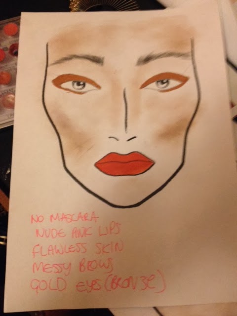
FACE CHART 1


FACE CHAR 2


I have designed two different face charts that show makeup in two different types of intensity. I am going to use the first face chart as it is subtler which I think will allow the model to look manly without accidentally straying into drag or camp. I have to remember that the point of this shoot is to show the taboo of a manly man wearing makeup because that is more diverse than a camp man wearing it.

UPDATE:
I have done the shoot today and had a few issues. I applied face chart 1 on the model and although it looked good in person it just wasn't translating well to camera. I chose face chart 1 because it was the more subtle of the two but on camera it looked TOO subtle and you could hardly tell that the model was wearing makeup. 
I didn't feel as though the makeup of face chart 1 was portraying my idea properly. 
I had also planned for this shoot to be the pulled out one, but again this wasn't working because you couldn't see the makeup, so I decided to solve this by doing two things:

1) change this to the head shot and change the Jewel shoot to the pulled out one because the model has more styling that could be included in the shoot
2) try face chart 2, which is more extreme makeup but have a manlier pose to even it out.


Although I DO like the first image and face chart design I think that the second one reflects my ideas more and reads better so I plan to keep it for one of my final images.


Roger Ballen: Black and White Photography

As I plan to shoot my birthmark/melasma shoot in black and white I decided to look at some photographers that commonly use this medium, to look at greyscale tone and depth.

ROGER BALLEN

Roger Ballen is one of my favourite photographers. Not only does he shoot in beautiful tones of black and white but he also uses very diverse models. The tones of black and white that he uses is something that I am going to keep in mind when shootingmy look because he uses it in such an interesting way.


Most of his photographs have a very grey overveiw but my favourite ones are the ones that have deep shadows to the point where it's almost black. I think it gives the photo more depth. I would prefer to turn them black and white in post production rather thsn shoot in it so when I come to editing I am going to bear this in mind. 

TEST SHOTS - MACHO MAN


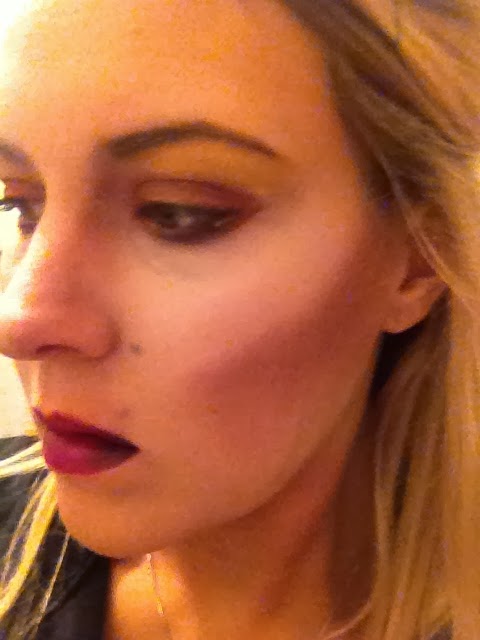
The look above was my test of face chart 1 for the macho man shoot. I still really like this look although I'm not sure how well it will show up on camera. Its difficult to see because what doesn't look a lot on a girl might look like a huge amount of makeup on a guy, so I will have to test on the day of my shoot to see what it looks like.


This test is a lot more dramatic but I'm scared that it will look drag on a guy. Again i will have to do tests on the actual model on the day of the shoot but the first can be adapted to look like the second so I'm not too worried. Its something that I will be able to adapt on the day.

Tests to Create Facial Melasma

I have don't some test shots so I can use the right products and techniques to make my application of the facial melasma as realistic as possible I have also experimented with shape and size.

Foundation
I did the first test using a dark foundation from Screenface. It applied well and because it is fairly fluid it allowed me to work with the shape easily. I could put more in some areas and less in others to change us the tone and texture. I like this product a lot.


The only worry I have is that the foundation melts easily. I am concerned that if I don't powder it will shine too much in photographs and look fake. I also have concerns about powdering over it because I want the mark to have the same natural dew that skin has. I experimented to see the effect that powder had and I found that if I used a tiny bit on a small fluffy brush it creates a perfect balance between shiny and matte.
Foundation

Mixing Medium and Brown Powder
My second test used brown eyeshadow and MAC mixing medium. I mixed the two together to create a brown liquid and applied it to the skin. The overall effect was okay but it dries very matte and that is not the effect I want. I haven't really worked with MAC mixing medium a lot so I'm a bit apprehensive about using it because I don't know how it's going to behave under studio lights etc. Also, if its anything like Illamasqua's Sealing Gel it might crack when it dries and I need a product that is a lot more movable.

Mixing medium and brown powder


I really like the foundation test so I am going to use this in my final image. It moves well with the face and behaves itself under studio lights as long as I powder softly over it. Another good thing I've found about it is that you don't have to use a lot of product because it goes a long way.

I have also tested shapes while I was testing products. I like the bigger shape and like that it goes over the eye. i will have to keep it to the outside of the eye so that it doest smudge into creases as i don't think even powder could save that.

The smaller mark doesn't look dramatic enough - it looks like an accident where as the big mark is making a point that the shoot is showcasing it. So I will use the foundation and powder to create a large mark with soft edges that goes around the eye like the facechart below.


TEST SHOTS - Jewel

Here are some test shots I did based off of the face charts I did for the jewel. The photos aren't great quality but seeing the makeup in person really helped me figure out the difference between the two looks and what would adapt to an older face better.


This has confirmed my decision to use the more pink toned one as it looks more striking and I think it will contrast more against older skin.

What will I improve?
When I apply this to the model I will use a much lighter touch and take a lot more time over it. These tests have told me I need to do that. I have allotted time when I do the shoot to make sure I have plenty of time so I don't have to rush.

Design Development - The Birthmark (Melasma)

I have done an individual mood board for the Birthmark melasma look. I have pulled in all the thigs that have stuck in my mind the most that I want to contribute to my final look.


It incorperates what I thought were the most important images I found in referencing melasma when I recreate the syptoms. It aso refrences black and white photography because I plan to do this shoot in black and white, I have looked at photographers like Roger Ballen and Helmut Newton, who both use diverse models in their photography as well as having my favourite tones of black and white in their work.  The bald freckled girl show my idea that you dont need flawless skin to be completely beautiful and the speckles represent imperfect skin. The silhouette relates to my photo composition as I am planning a side profile. 


Design Design Development of The Jewel

I have created an individual mood board for my Jewel shoot, which can be seen below.


The mood board really helps me organise all my ideas. I have included the main icons and have strongly featured the jewel theme in as much as colour and actual jewellery.  The albino turtle represents the eccentric idea and the Helmut Newton image is there because i think the subject embodies everything I'm trying to say about this project. The amethyst represents the general colour tone of the shoot - the model will be wearing a purple dress and covered in jewels.

I have finally chosen which face chart to use and I think that after tests I can see that the pink toned one was more extreme and colourful, and I want to stick to what Alyson from That's not my Age told me about colour being key in fashion in age, so I am going to use that one, featured below.